Creating a custom floral illustration for PC Express

Date 03/07/2023
The Brief
One of our teams on the ecommerce Grocery website, requested a new icon for the “Floral” category.
The new “Floral” icon needed to fit in with the rest of the icons on the website.
Team Members
Myself (Associate Product Designer )
My Responsibilities as a (Associate Product Designer ) :
Icon illustration
Tools:
Figma
Marker and Pen
Procreate
Timeline:
2 weeks
Research insight to the problem
I researched the look and feel of the Loblaws branding and current icons list so that the new “Floral” icon flows with the rest of the icons.
Process


I created multiple alternate ideas of flower icons in marker and paper. I went over sketches with senior product designers and narrowed it down to two potential images.
Define the problem
Create an icon that matches the branding and that's simple enough to view at a small size.
Which imaging flows with branding better?
Test potential solutions
Created multiple options in variety of colors of both illustrations to see if look and feel flows with Loblaws family of icons as well as focusing on branding of red as its a theme on Loblaws products.

1st image – too many things going on with flower and vase when scaled down (small size).
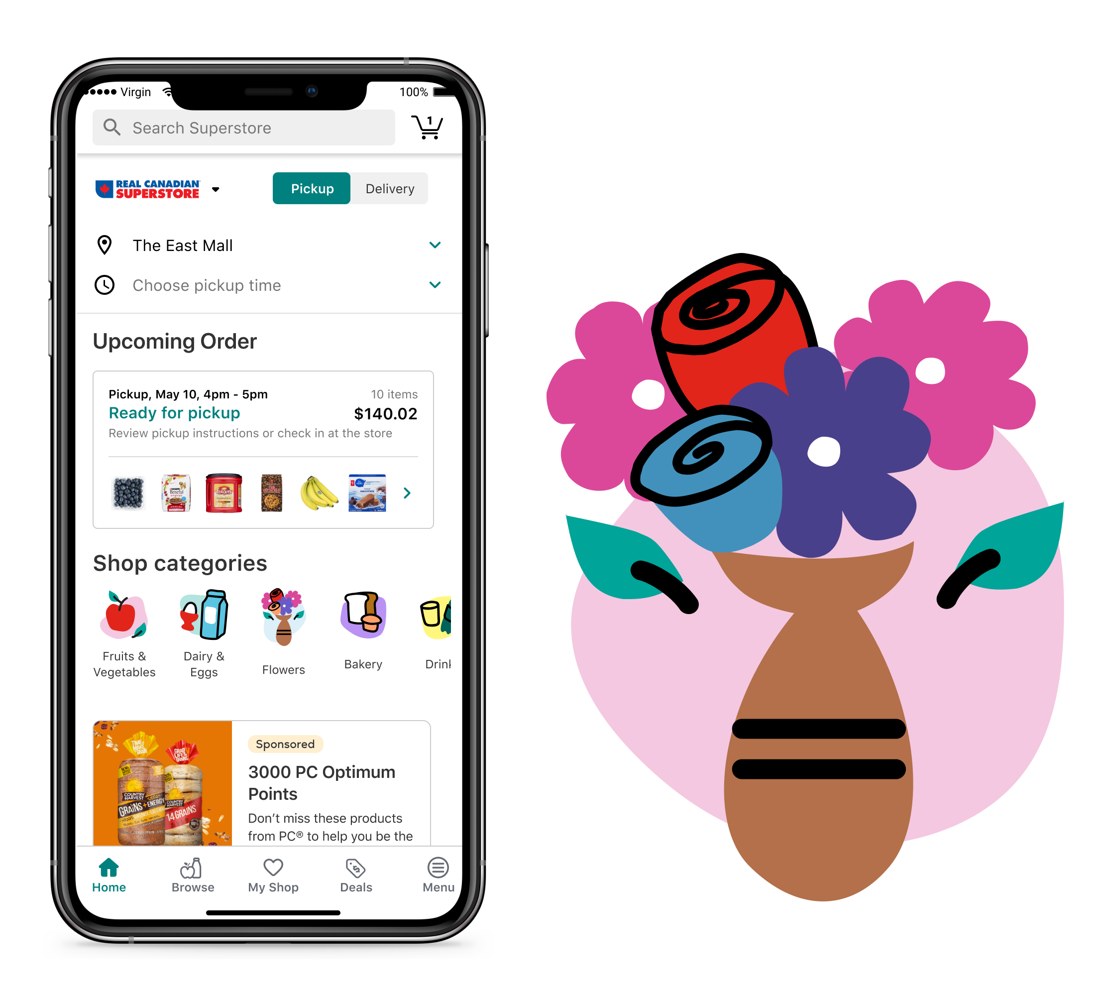
2nd image – Worked well but too many petals, I needed to simplify further and increase the size of the petals

Re-created the 2nd image once more with bigger petals and flower size.


Updated Floral Icon Exploration

As a continuation of this project, I revisited the floral category icon and explored a more simplified lily-inspired form. I focused on creating a recognizable flower silhouette that could work clearly at a small digital size while aligning with the visual style of Loblaws.ca’s current category icons.
The updated icon builds on my original exploration while refining the shape, proportions, and overall simplicity for a more cohesive digital experience.
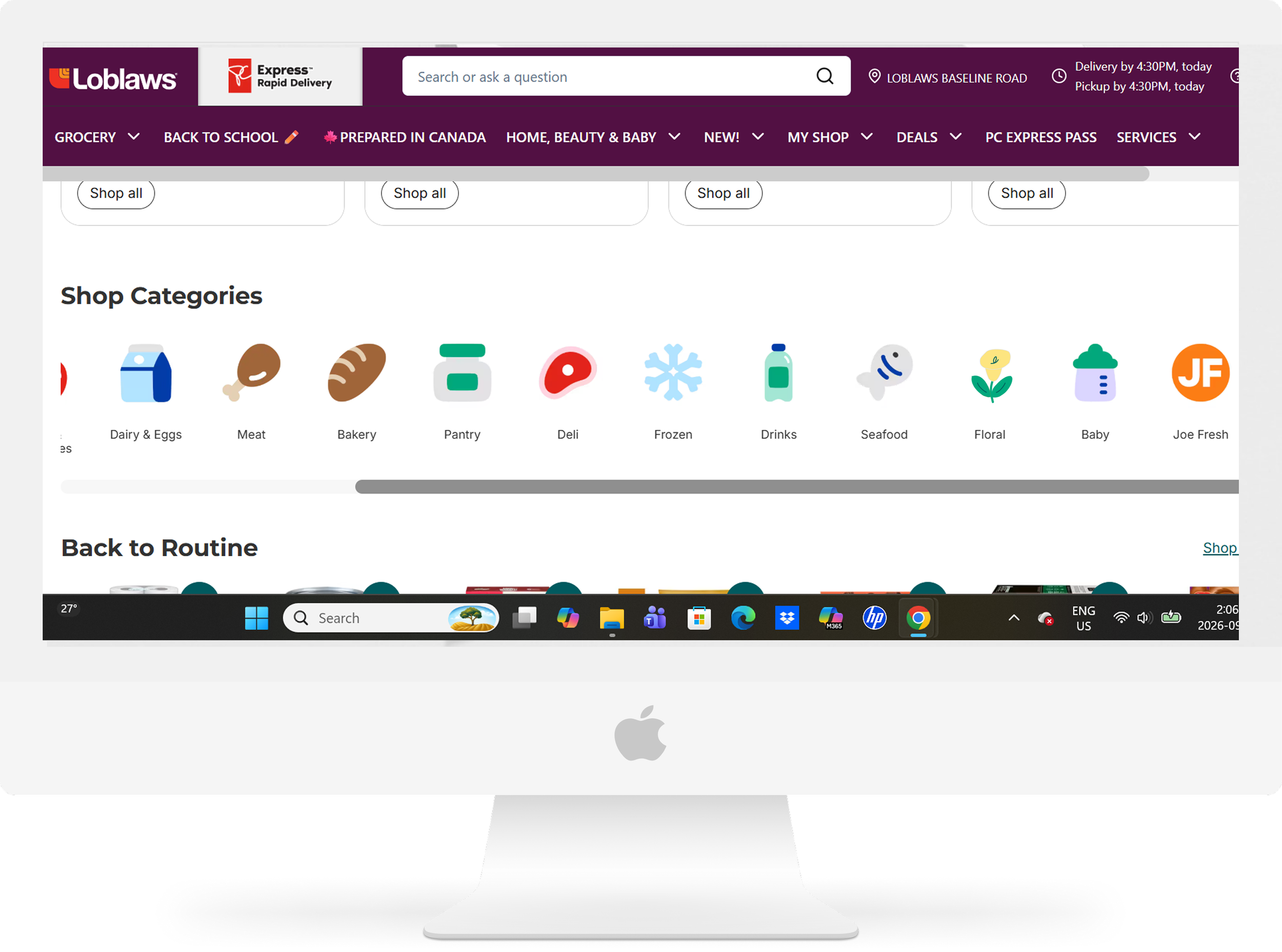
Lily icon → Floral category
Conclusion:
This project strengthened my ability to translate a recognizable visual subject into a simple, scalable digital icon while considering brand consistency and usability at smaller sizes.
Revisiting the floral icon also gave me an opportunity to refine the original concept and explore how the design could evolve alongside the visual direction of Loblaws.ca.