Stamping Culture

Date 09/18/2024
The Brief
Design a series of collectible postage stamps for Canada Post that celebrate Canada’s culture and for this project I decided to go with symbols of good fortune from around the world. The goal was to express both cultural richness and positive symbolism in a playful, vibrant, and unified way.
Team Members
Myself (Graphic Designer & Illustrator)
My Responsibilities as a (Graphic Designer & Illustrator ) :
Concept development
Cultural research
Illustration
Color theory application
Layout and presentation
Tools:
Adobe Illustrator
Procreate
Timeline:
2 weeks
Research & Cultural Insight
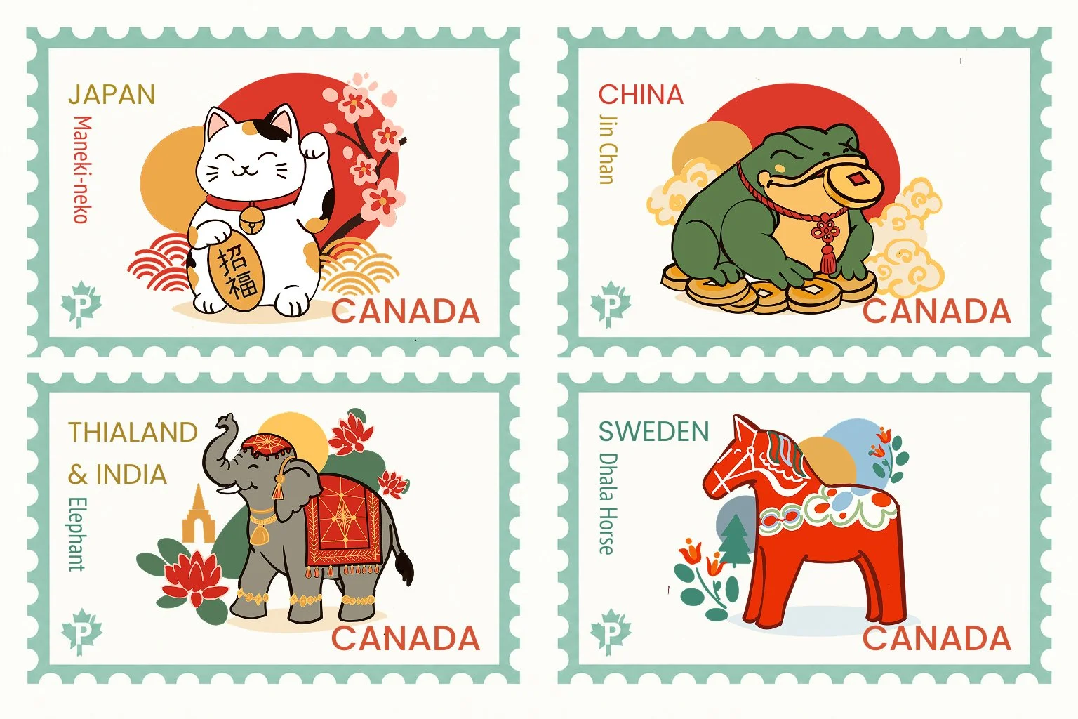
Canada prides itself on its cultural diversity. I selected four iconic symbols that represent good luck or fortune from different cultures present in Canadian society:
Japan: Maneki Neko (Lucky Cat)
China: Jin Chan (Money Frog)
Thailand & India: Decorated Elephant
Sweden: Dala Horse
Each symbol was researched for its meaning and cultural importance, ensuring accurate representation.
Design Approach
Used organic, minimal line art to give the illustrations a contemporary and playful feel
Created overlapping bold color shapes behind the icons to unify the series and highlight energy/luck
Applied a soft pastel border to frame each stamp while keeping focus on the central icon
Paired each country’s name with a modern sans serif and serif pairing for a sense of clarity and elegance
Consistent “CANADA” branding was added to root the series in its national identity
Color Symbolism
Each stamp uses culturally meaningful and vibrant colors:
Red & Gold (Maneki Neko & Jin Chan): wealth and good fortune
Orange & Grey (Elephant): prosperity and strength
Blue, Green & Red (Dala Horse): peace, vitality, and happiness
Updated Stamp Collection Exploration
After completing the original stamp collection, I revisited the designs to further develop the illustrations and strengthen the overall visual system. I explored more detailed character features, cultural patterns, decorative elements, and refined colour relationships while maintaining the original concept.
The updated designs were created to feel more expressive, polished, and collectible while keeping consistency across all four stamps through the border treatment, typography, colour palette, and recurring postage details.
Design Improvements
Added more expressive and detailed illustrations
Strengthened cultural references and decorative motifs
Refined colour combinations and visual hierarchy
Improved composition and proportions
Created stronger consistency across the four-stamp series
Made small refinements to the CANADA text and postage details.
Final Outcome
This project strengthened my ability to combine cultural research, illustration, colour, and typography to create a cohesive visual collection. Revisiting the original designs allowed me to refine my concepts, strengthen the cultural details, and create a more polished and expressive stamp series. The final collection demonstrates my ability to develop, evaluate, and improve a design while maintaining a consistent visual system across multiple pieces.